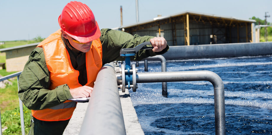

June 25, 2019 — Some 80% of wastewater worldwide goes back into ecosystems without getting treated for pollution. Human-caused climate change is making droughts more common and water more scarce, threatening to displace tens to hundreds of millions in the next decade. People use water to grow crops, cool power plants, flush toilets and more. And global demand for water keeps climbing, with a projected rise of 20–30% over the next 30 years.
But if you just looked at sketches of the water cycle — the diagrams that pop up everywhere from elementary school textbooks to scientific publications — you wouldn’t know about this human impact. In fact, most water cycle diagrams don’t show humans affecting water at all, according to a study published in Nature Geoscience earlier this month by researchers from North America and Europe. Of 464 diagrams from a dozen countries they examined, only 15% depicted humans interacting with water.
“Correct depictions of the water cycle will not solve the global water crisis,” the researchers write. But they call for better diagrams as an “important step” toward equitable policy, sustainable development and new ways of thinking at a time when humans are changing the face of the planet.
After doing a Google (or Baidu) image search for “water cycle,” the researchers investigated the top 30 results for 12 countries including the U.S., China, India, Mexico, Tunisia and more. They also looked over additional textbooks, scientific articles, government publications and online sources in English.
Fewer than 1.5% of those diagrams showed the effects of climate change. Water pollution made an appearance in just 2%. That’s concerning, the researchers contend, since “these diagrams both influence and represent the understanding of researchers, educators and policymakers.” A shift to diagrams that illustrate how human societies relate to oceans, lakes, rivers and groundwater could present a more accurate picture.
Water diagrams could also do a better job conveying just how much water is actually available for humans, the researchers argue. None of the diagrams in the review specified what fraction of the water shown could be used within sustainable bounds, nor did any mark the difference between saltwater lakes and lakes filled with drinkable freshwater. Plus, none of the inspected diagrams noted that 97% of groundwater on Earth is effectively nonrenewable on a timescale of centuries.
In the paper, the authors offer their own diagrams that seek to correct some of the flaws they see in typical depictions of the water cycle. Unlike the standard images they reviewed, the researchers’ version shows renewable and nonrenewable groundwater in different colors, and illustrates how water enters and exits human usage.

This new water cycle diagram includes human impact, a key component neglected by most depictions. Courtesy of Benjamin Abbott. Click to enlarge.
The new diagrams also highlight flows of water from soil moisture, water bodies and pollution — often referred to as green, blue and gray water, respectively — which appeared in only a handful of illustrations assessed in the study. The researchers also created an additional image that covers some of the big ways human impacts interfere with the water cycle, such as land-use change, melting glaciers and flood damage attributable to dams.
There’s no way to know exactly how much the omissions in typical water diagrams affect people’s attitudes and government policy, if at all. But the researchers note that the flaws they’ve found in the diagrams line up with some of the biggest failings in water management, such as neglecting to pay attention to change over time and tending to view water quality and water quantity as separate issues.
Either way, the study illustrates how we can illustrate the water cycle to better represent our changing planet — and the profound ways in which humans are driving that change.
Related Posts
Ensia shares solutions-focused stories free of charge through our online magazine and partner media. That means audiences around the world have ready access to stories that can — and do — help them shape a better future. If you value our work, please show your support today.
Yes, I'll support Ensia!