
September 10, 2019 — The astronomer Carl Sagan famously referred to Earth as a “pale blue dot” against the dark backdrop of space.
Our planet is blue, yes, but also green — teeming with life, from preening birds to leafing trees to fleeting microbes. Down but not out, living organisms span the globe in immense diversity, and meaningful action could make a difference in their conservation.
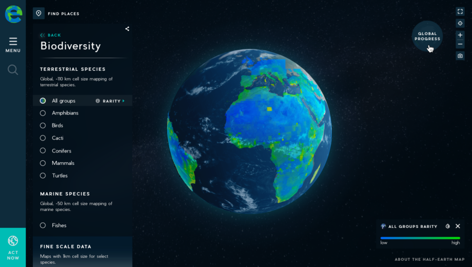
That’s the message of the Half-Earth Project Map. Spearheaded by the E.O. Wilson Biodiversity Foundation, the interactive map was created by the design firm Vizzuality with data drawn mostly from the Map of Life.
By clicking on various element options, users can explore the diversity of life on land and at sea and discover where various groups as broad as mammals and as narrow as hummingbirds are common and rare. Other maps depict the human pressures that threaten living organisms by destroying habitat and areas currently devoted to conservation.
From a drop-down menu on the left side of the screen, users can click to map the geographic range of birds, mammals, amphibians, marine fish and other living things. This biodiversity data comes in two flavors: “Richness” describes how many species inhabit an area, while “rarity” pinpoints just how unique an organism is to any particular place.
A drop-down for human impacts can reveal where farms and cities place pressure on the biosphere. Users also can look at a menu for “existing protection” to see which parts of the planet are covered by conservation areas.
Users can glean new insights by layering data on top of each other — for example, by mapping the locations of protected conservation areas over a display of biodiversity.
Most of the data are global, so the map can’t show much detail when zoomed in. But one of the project’s stated goals is to chart the geographic distribution of organisms “at high enough resolution to drive decision-making” on how to best protect the highest number of species.
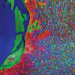
To showcase the potential for more precise information, the Half-Earth Project includes options to map high-resolution ranges for a handful of animals and plants. One map displays the species diversity and rarity of hummingbirds across North and South America at a resolution of 1 square kilometer (0.4 square miles), meaning that users can zoom much closer to Earth’s surface before the map starts to appear blotchy or blocky.
Another high-detail map presents biodiversity statistics for selected organisms in South Africa, including amphibians, birds and restio (a grass-like group of plants native to the country).
The Half-Earth Project is a campaign to increase the portion of Earth’s terrestrial and marine area covered by conservation commitments. Globally, according to the International Union for Conservation of Nature, protected areas cover around 15% of land and 7% of oceans. The Half-Earth campaign’s goal is to raise those numbers to 50%.
That call, associated with movements like Nature Needs Half, was promoted by famed biologist (and Half-Earth Project lead scientist) E. O. Wilson in his 2016 book Half-Earth: Our Planet’s Fight for Life. The ambitious target has been hailed by scientists who say it’s necessary to halt “massive displacement of other species.” Critics, however, contend that the 50% goal ignores needed economic changes and, with conservation’s typical focus on low-income tropical countries, could spur the displacement of “communities that are poorest and least responsible for our current environmental predicament.”
Whatever the solution, the problem of species extinctions remains real, and the Half-Earth Map offers one more way to see that problem — and think about how we might create a better future.
Related Posts
Ensia shares solutions-focused stories free of charge through our online magazine and partner media. That means audiences around the world have ready access to stories that can — and do — help them shape a better future. If you value our work, please show your support today.
Yes, I'll support Ensia!