December 15, 2014 — We’re living in an era of Big Data, but too often it’s nothing more than a fire hose of numbers and data sets that most would have difficulty understanding. Increasingly, though, entities such as non-governmental organizations, research institutes, academic journals and, most significantly, the U.S. government, are sharing massive stores of data not just for transparency, but also to encourage others to use the data in helpful, innovative ways.
“Lots of government data has always been available, particularly in the environmental area and science, but it hasn’t always been really accessible or easy to find, or in formats that nonscientists understand,” says Jeanne Holm, who serves as evangelist for Data.gov — a growing online repository of data from federal, state and local agencies — as well as chief knowledge architect at NASA’s Jet Propulsion Laboratory.
Today, open data and open-source software — computer software that is made publicly available for anyone to use and manipulate in any way — is an important part of the process of translating data into something an engaged citizenry can use to shine a light on a wide range of environmental (and other) issues and point to solutions.
Following are some examples of how academics, programmers, NGOs and others are doing just that.
Water
In California, Laci Videmsky, project director with the Resource Renewal Institute and a visiting lecturer at the University of California, Berkeley, College of Environmental Design, is part of a team of designers, hydrologists and developers creating the New California Water Atlas — a digital upgrade to the California Water Atlas published in 1979 that has been called a “monument of 20th century cartographic publishing.” The vision for the New California Water Atlas, Videmsky says, is as a user’s guide to the state’s hugely complex and overburdened water system. The atlas includes an interactive water-pricing map showing what ratepayers across the state are paying per 100 cubic feet. “We want to provide possible benchmarks for the utilities, so they can see if their pricing is sustainable,” says Videmsky, noting that pricing for water in California is generally low and does not reflect real costs.
In southeastern Louisiana, land mapping is becoming water mapping because dredging, energy development and sea-level rise are robbing the state of 16 square miles of land each year.
Water district managers tend to tightly guard their data but the New California Water Atlas is working to free it, he says, so organizations or individuals might help innovate better management. Videmsky and his colleagues often scour water agency websites for water data, though he says over time some agencies have begun sending them data directly and exploring ways to make it more accessible to the public. “The goal is to explore how open data can play out in the water sector. We’re creating a sandbox for more people to experiment with data.”
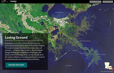
Meanwhile, in southeastern Louisiana, land mapping is becoming water mapping because dredging, energy development and sea-level rise are robbing the state of 16 square miles of land each year. That’s the equivalent of a football field every 48 hours, according to an explanatory multimedia feature from nonprofit news organizations ProPublica and The Lens. The feature, “Losing Ground,” is told largely through interactive maps based on data from NASA and the U.S. Geological Survey.

A joint project of ProPublica and The Lens, “Losing Ground,” a story of land loss in in southeastern Louisiana, is told largely through interactive maps.
While “Losing Ground” is advanced, ProPublica uses open source mapping and software tools and shares its mapmaking and data-collection tools publicly on its Nerd Blog.
Agriculture
This past summer Data.gov’s Climate Data initiative, a government website dedicated to data related to climate change, launched a food resilience theme to help communities and individuals anticipate and respond to changes in food supply related to climate change. This section of the government website offers data sets, maps and mapping tools related to food distribution, costs and crop climate resilience, sourced from agencies such as the U.S. Department of Agriculture and the National Oceanic and Atmospheric Administration.
In the same vein, The Global Landscapes Initiative at the University of Minnesota’s Institute on the Environment creates a wide range of maps and visualizations related to agriculture in order to show links between our changing climate, agriculture and other land uses and how they impact ecosystems around the world so stakeholders can manage landscapes to maximize their benefits while reducing impacts. Among other projects, GLI partnered with McGill University’s Land Use and the Global Environment to launch EarthStat, a website for viewing and downloading agricultural and land use data. EarthStat offers a gallery of maps depicting things such as “yield gaps,” the differences between actual and potential crop yields, around the world. The organizations obtain data from a range of sources — from the Food and Agriculture Organization of the United Nations to Columbia University’s Center for International Earth Science Information Network, and even from individuals. Peder Engstrom, a geographic information systems scientist with GLI, says data are becoming increasingly open and available, helped in part by the growth of cloud computing and data storage options. He says Data.gov is helping to bring “disparate groups together and give them a space to work” with these growing stores of data.
Wildlife Conservation
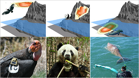
When James Sheppard, a postdoctoral fellow at San Diego Zoo’s Institute for Conservation Research who studies condors in Baja, Mexico, wanted to better understand how the birds use vertical space and how they might be affected by the placement of wind turbines, he looked at data from sensors (called biologgers) attached to the birds’ bodies and precisely recorded their movements. While most studies track animal movements in two dimensions, data from biologgers give researchers the power to track vertical movements as well — altitude for flying animals, elevation for terrestrial ones or depth for aquatic species.
Sheppard had previously studied the dugong, a type of sea cow related to the manatee, and the San Diego Zoo has a conservation program in which, along with Chinese colleagues, it is studying giant pandas. All three animals are of special conservation interest, and to aid in recovery efforts, groups of all these species have been outfitted with biologgers. Sheppard worked with USGS ecologist Jeff Tracey to map condor movements in three-dimensional space. They decided to do the same for the dugong and giant panda, to deepen scientific records of their movements as well. (Their full report is available at PLOS ONE.)
The researchers relied on a supercomputer at the University of California, San Diego, to do the computational heavy lifting, and VisIt, open source software developed by the U.S. Department of Energy, to create the animated map.

Using sensors known as biologgers, researchers track animal movements in three-dimensional space — altitude for flying animals, elevation for terrestrial ones or depth for aquatic species.
What they found in terms of the condors was that the birds’ movements indicated trouble: Part of their home range intersects with a planned wind farm in Baja. Those turbines have already been licensed and permitted, but Tracey expects the research to be useful for informing other projects. “We’re studying things like wind velocity in condor home ranges, so in the future we can say, ‘These are the types of aerial habitats condors inhabit,’ and then use it in a more predictive way to help do things like site wind turbines,” Tracey says.
Transit
Open data mapping has also helped researchers track how humans move throughout their home ranges — while also improving car-free options. This effort started with the General Transit Feed Specification, a tool that Bibiana McHugh, an employee of the Portland, Ore., transit agency TriMet, dreamed up while on vacation in 2005. It allowed public transit agencies to translate their data into a common standard. This paved the way for thousands of developers and mapmakers to create great transit apps — most notably Google, which uses GTFS to add public transit information to Google Maps.
A few years later, San Francisco Bay Area–based GIS expert Ryan Branciforte and software developer Jereme Monteau built Transit & Trails, an application that provides detailed guides to accessing Bay-area trailheads and campgrounds via public transit. This year the pair launched a new start-up, Trailhead Labs, through which they are building a platform to help merge public transit data with park and trail data on a national and even international scale.
To do so, they’re also working closely with Code for America, an organization that uses open-source software and recruits teams of “civic hackers” to help government agencies make better use of technology to run government. Code for America has created OpenTrails, a data specification, or guideline, that offers a means for park agencies to standardize their trail data — everything from trailhead coordinates to facilities to signage or concessions. Through Trailhead Labs, they’re contracting with park agencies to build applications hikers or other trail users can use to not only find trails but also connect with nearby public transit lines, find groups of like-minded users, volunteer for park cleanups and more.
The goal is to not only make getting to parks via public transit vastly easier than it is now, but also help outdoorspeople make a seamless transfer from bus or train to trailhead — and back again.
“Today, parks’ trail data is often locked up,” explains Branciforte. “[Park agencies] did not do it intentionally, but because they’ve created data sets that help them internally. There is no easy way for them to publish the information out into the world.”
With Code for America’s help, parks can now standardize their unique trail data using a translation tool that converts that data into a consistent format. Platforms such as OuterSpatial can then use the standardized data to create trail maps and applications for specific parks. The goal is to not only make getting to parks via public transit vastly easier than it is now, but also help outdoorspeople make a seamless transfer from bus or train to trailhead — and back again.
Oceans
The oceans are a huge, largely untapped resource for mapmakers, whether they’re interested in creating art, tracking ocean pollution, cataloging the state of coral reef health or making the Biogeographic Atlas of the Southern Ocean a benchmark against which future climate change impacts can be measured.
Often, tremendous software resources, expensive sonar equipment and a crew of experts are required to build sophisticated ocean maps, such as that of the 800-mile Pacific coastline that the California Seafloor Mapping Program created. Producing such a map is well out of reach of most mapping hobbyists. However, tools are emerging that can leverage stores of sensor data from ocean observation systems as well as GIS data and use them to convey stories and inform research.
Esri, a major supplier of GIS software used to build maps for a range of major customers (including the U.S. government), offers an open-source platform called ArcGIS Online that gives anyone license to use its resources, such as its ocean base map, to create online “story maps” (see Mapping the Course). “This is a new medium for not only sharing maps but telling a specific and compelling story by way of those maps, with sophisticated cartographic functionality that does not require advanced training in cartography or GIS,” says Esri chief scientist Dawn Wright.
Esri has made a number of environmentally themed story maps, such as one explaining how oil spills are monitored from space. Such story maps can spark young people’s curiosity. For example, using an underwater remotely controlled vehicle, a map of storm drain networks of greater Los Angeles and a boat, students at Clark Magnet High School in La Crescenta, Calif., tracked plastic pollution from its start as street litter to the Pacific and documented it in a map.
These are just a few of the ways scientists and technologists are turning the previously unseen stories behind the data all around us into something we call can visualize. ![]()
Disclosure: Ensia is an independent publication of the Institute on the Environment at the University of Minnesota, which sponsors the Global Landscapes Initiative.
Ensia shares solutions-focused stories free of charge through our online magazine and partner media. That means audiences around the world have ready access to stories that can — and do — help them shape a better future. If you value our work, please show your support today.
Yes, I'll support Ensia!
